2008年10月19日 星期日

Core Colour(2000-2009)

Core Colour(2000-2009)


We can see the colour trend of Miu Miu through the core colour.
Miu Miu likes to use monochromatic colours(especially black ,white , light brown) and contrast colours(bright orange VS green,red VS green,red VS blue,etc).Low chromatic colours she also like to use,like dull red,deep green,dark blue and dull brown,which can giving a colour harmony.

Miucca Prada use the colours that the public will not accepted easily ,the colours she doesn't like and thinks that ugly(peacock green) .It seems that she make ugly clothes from ugly colours:simply bad taste.But end up looking good anyway.She likes to take risks and she won't follow the fashion main stream in the world.She just do what she wants.We can see that being in the forefront is not her choice.She follows her instinct.And even if she question whether what she is doing makes perfect sense to her or others.

The important things for her is that she thoroughly believe in it.

Timeline of colour family 2004-2009


Timeline of Color Family 2000 - 2003

Timeline of Color Family 2000 - 2003

 >click to enlarge photo

2008年10月18日 星期六

Miu Miu Spring 2009 RTW


Theme
"It is an investigation of our history of our Europrean past."
In this collection,the models who dressed in like gladiator in the European past.There are nipped-waist dresses,as well as tops and skirts in pleated burlap or silk.Most of them layered with a low,hip-slung apron.And sometimes,the fabrics wre dotted with fraying holes.The most humorous and interesting point is,this collection involves graffiti elements.


We can see that black(pantone 426C),cerise(pantone 172C)and beige(pantpone 148c) are the major colours used in this collection.

-Colour theories:monochromatic colour scheme(beige) and analogous colour scheme(cerise&beige&dullpink)
-More low intensity and low value colours than before


This collection's colours are in Roman feeling.The cerise lines or patterns involve the graffiti and pop art elements.These provide a strong contrast and just like a crossover of Roman and pop art in Andy Warhol's style.It can see that Miuccia Prada loves experimentation in lines,colours,mixes of influences,and inspiration.   

Miu Miu Fall 2008 RTW


Theme
'Take sport in a new fashion direction.'
This collection is just like a new transformation of jockey uniforms.


We can see that in this collection,except black,different values and intensity of green taking the majority of core colour.

-Colour theories:Monochromatic colour scheme(achromatic colour:black,different value and intensity of hue green and red),analogous colour scheme(red&red-orange&orange) and complementary colour scheme(red&green)
-various level of fullness of green and red
-saturation contrast


In this collection,it is obvious that Miuccia Prada has adopted the colours that is not accepted easily,like peacock green,bright orange.And these colours make a big contrast in vision.Just like Prada said, she likes to challenge her instinct.She used the colours she doen't like. She make ugly clothes from ugly materials:simply and taste.But they end up looking good anyway.

Miu Miu Spring 2008 RTW


Theme
'life as theater, and all the clichés of how people represent themselves in the world'
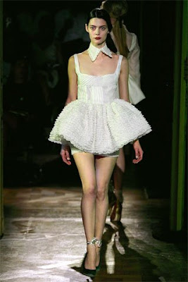
Miuccia Prada is inspired by the common point of Swan Lake dancers, sumo wresters, a girl in a French-maid costume, Playboy Bunnies, and a Burning Man festivalgoer.And she is most inspired by the ballerinas and the French maids.


-Colour theories:monochromatic colour scheme(achromatic colour:white and black,red),single split complementary colour scheme(dullgreen&red-violet& high chroma red-orange)
-Principle of order:red&dullgreen&purple&black is equally distributed)
-Big colour contrast


In this collection,same as the previous collection,it has big contrast in colour.The colours used are in common with last season's: they were subtly perverse.

2008年10月17日 星期五

Color Changing Mood Monster

I have found this in youtube.
The color changing mood monster is interesting.When it get angry,it becomes orange;When it feel sad,it becomes blue.
It will change its color while its mood changes.

Color represents mood

Like death and taxes, there is no escaping color

It is ubiquitous. Yet what does it all mean? Why are people more relaxed in green rooms? Why do weightlifters do their best in blue gyms?

Colors often have different meanings in various cultures. And even in Western societies, the meanings of various colors have changed over the years. But today in the U.S., researchers have generally found the following to be accurate.

Black

Black is the color of authority and power. It is popular in fashion because it makes people appear thinner. It is also stylish and timeless. Black also implies submission. Priests wear black to signify submission to God. Some fashion experts say a woman wearing black implies submission to men. Black outfits can also be overpowering, or make the wearer seem aloof or evil. Villains, such as Dracula, often wear black.

White

Brides wear white to symbolize innocence and purity. White reflects light and is considered a summer color. White is popular in decorating and in fashion because it is light, neutral, and goes with everything. However, white shows dirt and is therefore more difficult to keep clean than other colors. Doctors and nurses wear white to imply sterility.

Red

The most emotionally intense color, red stimulates a faster heartbeat and breathing. It is also the color of love. Red clothing gets noticed and makes the wearer appear heavier. Since it is an extreme color, red clothing might not help people in negotiations or confrontations. Red cars are popular targets for thieves. In decorating, red is usually used as an accent. Decorators say that red furniture should be perfect since it will attract attention.

The most romantic color, pink, is more tranquilizing. Sports teams sometimes paint the locker rooms used by opposing teams bright pink so their opponents will lose energy.

Blue

The color of the sky and the ocean, blue is one of the most popular colors. It causes the opposite reaction as red. Peaceful, tranquil blue causes the body to produce calming chemicals, so it is often used in bedrooms. Blue can also be cold and depressing. Fashion consultants recommend wearing blue to job interviews because it symbolizes loyalty. People are more productive in blue rooms. Studies show weightlifters are able to handle heavier weights in blue gyms.

Green

Currently the most popular decorating color, green symbolizes nature. It is the easiest color on the eye and can improve vision. It is a calming, refreshing color. People waiting to appear on TV sit in "green rooms" to relax. Hospitals often use green because it relaxes patients. Brides in the Middle Ages wore green to symbolize fertility. Dark green is masculine, conservative, and implies wealth. However, seamstresses often refuse to use green thread on the eve of a fashion show for fear it will bring bad luck.

Yellow

Cheerful sunny yellow is an attention getter. While it is considered an optimistic color, people lose their tempers more often in yellow rooms, and babies will cry more. It is the most difficult color for the eye to take in, so it can be overpowering if overused. Yellow enhances concentration, hence its use for legal pads. It also speeds metabolism.

Purple

The color of royalty, purple connotes luxury, wealth, and sophistication. It is also feminine and romantic. However, because it is rare in nature, purple can appear artificial.

Brown

Solid, reliable brown is the color of earth and is abundant in nature. Light brown implies genuineness while dark brown is similar to wood or leather. Brown can also be sad and wistful. Men are more apt to say brown is one of their favorite colors.

Color Mood Chart


Colors can reflects our mood.
What is your mood today?


Black Color Mood Chart
  • TENSE
  • NERVOUS
  • HASSRASSED
  • OVER WORKED
Grey Color Mood Chart
  • ANXIETIES
  • NERVOUS
  • STRAINED
Amber Color Mood Chart
  • NERVOUS
  • EMOTIONS
  • MIXED
  • UNSETTLED
  • COOL
Green Color Mood Chart
  • AVERAGE
  • READING
  • ACTIVE
  • NOT UNDER
  • GREAT STRESS
Blue-Green Color Mood Chart
  • INNER
  • EMOTIONS
  • CHARGED
  • SOMEWHAT
  • RELAXED
Blue Color Mood Chart
  • RELAXED
  • AT EASE
  • CALM
  • LOVABLE
Dark blue Color Mood Chart
  • VERY HAPPY
  • LOVE
  • PASSION
  • ROMANCE
White Color Mood Chart
  • FRUSTRATED
  • CONFUSSED
  • BORED
Bronze Color Mood Chart
  • JITTERS
  • ANTICIPATION
  • RESTLESS
  • THOUGHTS
Pink Color Mood Chart
  • FEAR
  • UNCERTAIN
  • UNANSWERED
  • QUESTIONS
Yellow Color Mood Chart
  • IMAGINATIVE
  • WONDERING
  • THOUGHTS
  • OK FEELING
Orange Color Mood Chart
  • STIMULATING
  • IDEAS
  • DARING
  • WANTS
Red Color Mood Chart
  • EXCITED
  • ENERGIZED
  • ADVENTUROUS
  • READY TO GO
Purple Color Mood Chart
  • SENSUAL
  • CLARITY
  • PURPOSE
  • IS KNOWN

Miu Miu Fall 2007 RTW


Theme
'It's a vision of what's happening in the world right now with women.'
In this collection,the coats and A-line dress look like old ladyish.In reality, those A-line coats were 100 percent real leather, but lined with neoprene to look spongy and fake.Miuccia Prada thinks that people are focusing on man-made heavily.On videos and TV all of the women look fake. She wanted to show this plasticized vision, but filtered through classic pieces and sticking to tradition.


We can see that different values and density of brown has been used as the majority of the core colour in this collection.

-Colour theories:monochromatic colour scheme(variation of value and intensity of brown),analogous colour scheme(high chroma red-orange&dull beige&dull pink)
-same set of colour:variation in chromatic and value of red-orange


In this collection,Miucca Prada uses old ladyish colour-brown as the majority of the core colours.But the use of shocking orange , bright flesh colour and pink gives a big contrast with the brown and makes the total look trendy.